Pantone announced that Classic Blue is the color of the year for 2020. Color experts say that this enduring blue hue instills calmness and confidence, highlighting ones desire for a dependable and stable foundation as we usher in the new year.
KDG Interior’s Principal Interior Designer Peaches De Guzman-Grey said that classic blue is very interesting because it symbolizes many things and gives an impression of stability and honesty which can be associated with many objects.
Incorporating this classic color in designing your home while employing the basics of interior decorating can help improve the quality of life. It helps one relax and de-stress after a long day.
Peaches, whose designs and styling works are featured regularly on various magazines and TV shows, shares her expert advice and tips on decorating homes this 2020 with Classic Blue:
Go back to basics
Before deciding on what decorations you would want to put, it is important to evaluate certain considerations such as your preferences and lifestyle. Knowing these factors will make your home decorations work better for you and your family.
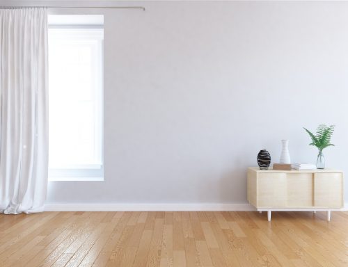
An example is, if your family has small kids, consider that your space should be child-friendly. It would be better if there are no sharp edges, the space is always safe, and there are rooms where they can play freely.
Design according to functionality
It is also essential to design spaces according to the use of your area and rooms. Certain portions of the house which are used for specific tasks require details appropriate for it. That’s why if you are going to decide the specifics such as lighting and furniture, always consider the room’s function and if it will help you perform your tasks easily.
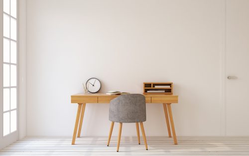
Incorporate Classic Blue in places where you want to be relaxed
Peaches mentioned that it is a calming color thus best to put it in rooms where you want to be relaxed. However, she also emphasized that you need to be careful in putting it in places like the kitchen or dining room as blue is known to be an appetite suppressant.
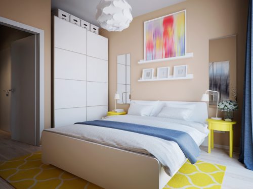
Use neutral colors and just inject the Classic Blue as an accent
Peaches shared that when she designs, she always sticks to neutral palettes, especially in walls and furniture.
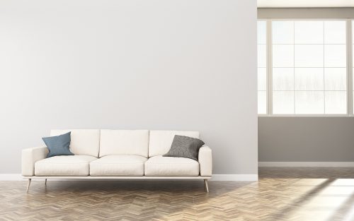
If you will go for neutral, you can instead use classic blue for throw pillows, carpet, accent chairs, and other accessories for emphasis.
Understand that designing is a process
If you have a preferred design, think about how the designs will work for you and do not just follow trends.
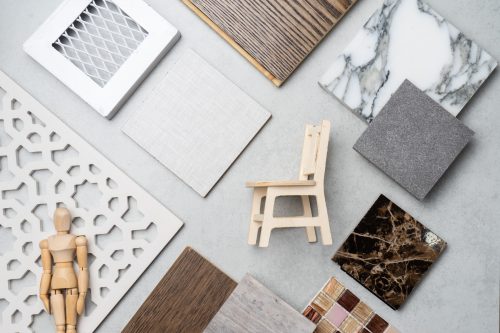
Consider practicality, because this will save you a lot of money in the long term. “Practicality also plays a big role,” Peaches says.
Be flexible
No matter how up-to-the-minute the Classic Blue is, especially for the upcoming year, don’t forget that it is just a trend which means it changes easily and dies down quickly.
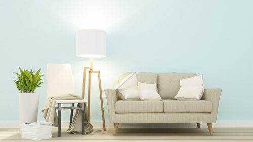
One thing Peaches advises. is to not make any drastic changes at home and decorate accordingly. If you really want classic blue, put it in places where it’s functional and relaxing and inject it as an accessory to pop it out in neutral palettes.
It is important to decorate your home as this can affect your family’s comfort and purposive use of space. Whether it’s a house or a condo, this experience becomes much more fulfilling when it’s a home that you can call your own.
Thinking of buying a home? Check out RCBC’s Home Loan Plus and enjoy flexible payment terms of up to 20 years. It comes with an automatic fire insurance coverage from Malayan Insurance for the entire loan term with easy to pay, 0% monthly interest installment on fire insurance. For more information, you may visit www.rcbc.com.

